By Arham saklia
adam j
> status: ONLINE
> accepting_collabs: TRUE
In the ever-evolving world of digital design, the success of a website or app hinges on how well users can interact with it. Visual hierarchy plays a crucial role in shaping those interactions. It’s the invisible roadmap guiding the user’s eyes to the most important parts of the interface. Whether you're a designer or just getting into web or app design, understanding the psychology behind visual hierarchy can be the difference between a cluttered mess and an intuitive, user-friendly experience.
Visual hierarchy refers to the arrangement and presentation of design elements to signal their relative importance. When done effectively, it leads users to key information and helps them navigate the content easily, without confusion. This concept draws on human cognitive psychology, leveraging the way our brains process visual information.
By manipulating elements such as size, color, contrast, whitespace, and alignment, you can direct the user’s attention where you want it to go. When a design lacks clear hierarchy, users may feel overwhelmed or miss critical features or calls-to-action (CTAs), which could lead to poor engagement or conversions.
Humans are naturally wired to look for patterns, order, and structure. When presented with a visual layout, we instinctively start looking for cues that tell us what’s important and how to navigate the information. Here’s where certain psychological principles come into play:
- Proximity: Objects that are close together are perceived as related.
- Similarity: Elements that look similar are considered to be part of the same group.
- Continuity: Our eyes tend to follow lines or paths, guiding us from one element to the next.
By applying these principles to design, you can ensure that users intuitively understand how elements relate to each other and what their next action should be.
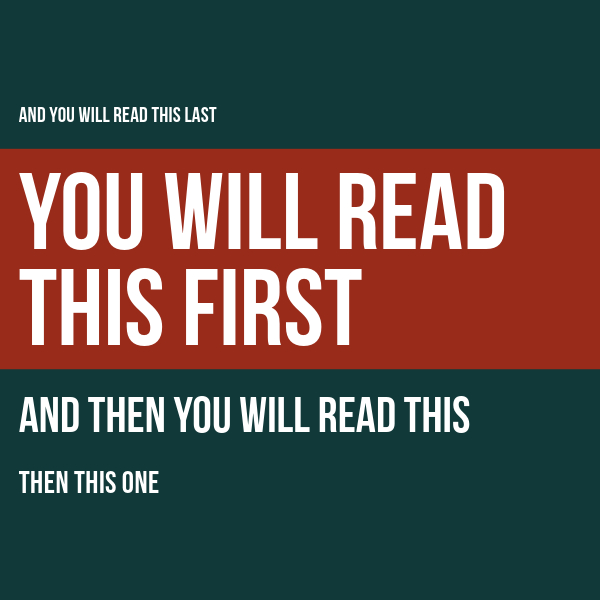
Research shows that users don’t read every word on a webpage; they scan. Studies on eye tracking reveal that most users follow an F-shaped pattern when reading text-heavy pages or a Z-shaped pattern on more image-driven layouts. This behavior reinforces the need for prominent headings, subheadings, and well-placed CTAs to capture attention in the right places.
When users have too much information to process at once, they experience cognitive overload. This can lead to frustration, confusion, or abandonment of the website or app. Visual hierarchy helps reduce cognitive load by breaking down content into digestible pieces, directing users step-by-step through the design.
To master visual hierarchy, designers use a range of techniques. Let's break down some of the most important ones...
Larger elements naturally attract more attention. This is why headlines are often the biggest text on a webpage, while body text is smaller. Buttons or icons that need emphasis should be bigger than less important elements. Think about how you can use size to make sure that users immediately see what you want them to focus on.
Color not only adds visual interest but also helps to distinguish between different elements. High-contrast colors (like black text on a white background) are easy to read and help important information stand out. Similarly, using a pop of color on a CTA button can encourage users to click, as it stands out from the rest of the page.
Additionally, color psychology can be employed to evoke certain emotions. For example, red can convey urgency (perfect for a "buy now" button), while blue can evoke trust (ideal for financial services websites).
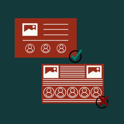
Whitespace—or the empty space around elements—plays a vital role in visual hierarchy. It allows the design to "breathe" and keeps it from feeling overcrowded. When used effectively, whitespace can enhance clarity and help the user focus on key areas.
In fact, the more whitespace surrounding an element, the more attention it commands. This is why minimalistic designs often seem so clean and sophisticated—by stripping away distractions, you draw the user’s eye directly to what matters.
Where elements are placed on a page also influences how they’re perceived. Items at the top of the page or on the left are generally viewed first. Consistent alignment and well-considered positioning can create a clean, orderly layout that makes navigation feel intuitive.
Using grids in design can help you maintain balance and harmony, ensuring that elements are properly aligned and aesthetically pleasing.
Using bold or italicized text sparingly can draw attention to particular words or phrases. However, overusing this technique can have the opposite effect, leading to a loss of emphasis and creating visual clutter.
Different fonts convey different tones and can be used to enhance the hierarchy. For example, bold sans-serif fonts are often used for headers, as they’re easy to read and convey importance, while more subtle serif fonts may be used for body text, giving a more traditional or elegant feel.
One of the most overlooked, yet powerful elements of visual hierarchy is whitespace. It provides structure and balance to your layout by creating visual breathing room. Whitespace isn’t wasted space; it's a functional tool that directs attention and can even make elements seem more prominent. For instance, ample space around a CTA button will draw the user’s eye and make them more likely to take action.
Whitespace also helps create focus and avoid overwhelming the user. Without sufficient whitespace, designs can feel cluttered and chaotic, leading to cognitive overload and frustration. A well-structured design with plenty of whitespace, on the other hand, feels effortless and guides the user intuitively.
quote
At the end of the day, it's night.


By Arham saklia

By Arham saklia

By Joe bloggs


Leave a comment